Putting the brand pillars and design elements into the new thermo item
Client: KOR
Keywords: Product Design, Product Development
THE CHALLENGE
KOR is a fashionable sport bottle brand and would like to set up a new thermo line.
There are fundamental differences between sport bottles and thermo tumblers so it is more important to understand the brand pillars and the design principles to align the new thermo tumbler to the brand.
THE OUTCOME
By following the design theory of KOR brand, a clean & pure thermo tumbler with a cool lock switch has been designed for the brand and everyday usage of the users.

DISCOVERY
Look into the brand pillars and design elements of existing items
The brand is well-known for its fashionable, cool and clean feeling.
Based on the fundamental features differences between sport bottle and thermo tumbler, the most recognizable handle and rim of the sport bottle will be difficult to apply to the thermo tumbler, therefore we have to find out more in-depth common design elements to maintain its product family to leverage the loyalty of existing customers toward its original brand.


IDEATION & DESIGN
Put the recognized family details into the design
Apart from the iconic handle design of sport bottle, there are several recognizable details that we can take from both “home” product items and “Sport bottle” series.
A U shape signature, tapered body & curved base will be applied to the new design with their iconic color combination

Add spice to the product
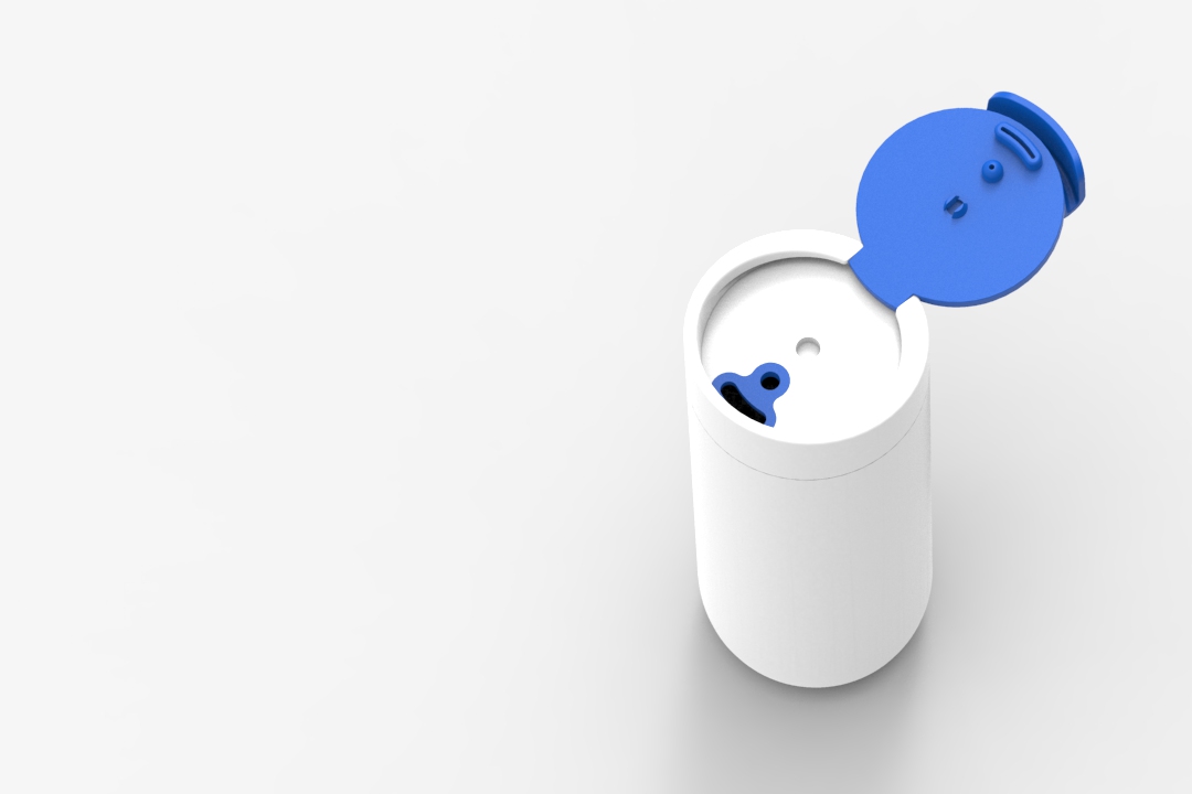
Apart from the appearance, the safety of transportation of the tumbler will also be put into consideration, a lock will be needed to avoid the cover pops up accidentally.
A seamless and fashionable lock will need to be added to the product cover.

IMPLEMENTATION
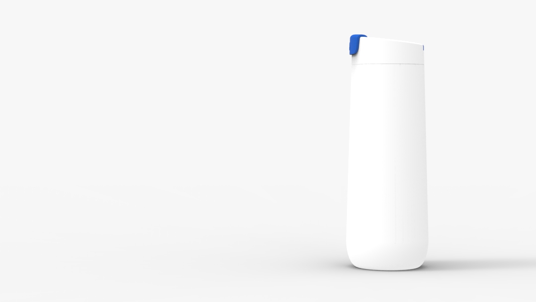
- Fashionable and neat thermo tumbler
A clean, pure and well-functioned tumbler for the KOR product family
An aligned product family can help leverage the loyalty of existing customers toward the brand. Therefore, we have put the recognized element into the design. A tapered body was applied to the new design with a curved base, in order to continue the image, we have selected the two-tone design with white and blue colors which were the featured tone of the brand.
A switch lock was equipped on top of the U shape cover seamlessly in order to prevent cover pops up during transportation while not affecting the clean and pure profile of the product.