
Linking the creators & people hunger for special products, create a platform that can fulfill the needs of both parties.
Client: Unique2Get
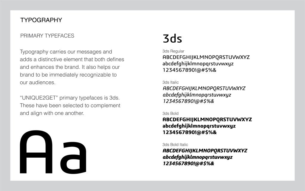
Keywords: Branding, Visual identity, Logo design
THE CHALLENGE
There are lots of talented creative individuals in Asia, they got great ideas and able to produce high quality items. While there is not much platform for the star to shine and provide enough support to help them catch great attention on the market in Singapore.
This is not only the loss for designer but also everyone of us, many people are tired of the identical item in chain stores and always hunger for fresh and mind-blowing design.
THE OUTCOME
Build an online department store that not only sell unique and special items in Singapore but to create a reciprocal community for creators and their admirers.
A platform allow creators to share their works & thoughts to others and vice versa. Interconnection will be the biggest power in “UNIQUE2GET”.

BRAND MISSION & VALUE
Reciprocal platform for creators to start their business
Provide marketing service, help talented creators to sell & promote their creations and provide a place for creators to kickstart their business within budget.
Build a community for creatives and creation’s lovers by providing a platform for them to communicate and exchange ideas & thoughts.
A symbol of trendy and out of ordinary.
A platform for creative product lovers to search for varieties of unique & special things.
Strive to help reducing time-consumed and tiresome works when looking for gifts items.

BRAND IDENTITY
Defining the brand
To highlight the brand motto of believing everyone is one of a kind, everyone deserve something uniquely special.
The brand position is targeting on trendy and out of ordinary. A platform for people to look for something new and special, to give people some new gifts ideas on any special days or festival on what to buy for others.
An aligned brand tone will be important to communicate the brand believe with people.
Art Direction
Memphis design style was selected for the brand as they share similar believes. Memphis represented a reaction against the status quo, being radical, funny & outrageous which is aligned with the brand image. Therefore a series of muted color were selected and combine to create a vibrant feeling while still look modern and comfy.
We have continue the vibe through the whole brand, from logo design to graphic for social media, font style, in order to communicate the brand in all level by design.


Logo Design
To show the brand an online store platform, we have pick the first letter of Unique, 2 & Get – U, 2, G to form a shopping cart in order to show the most initial function of the platform
The font were chosen in a bit fat & clean outline with special arrangement to bring out the modern fun design feeling.


